

Graphic tees are back for 2026 as a nostalgia-forward, cleverly restrained statement piece. The dominant move is picking one bold tee and letting it carry the outfit, then pairing it with tailored basics or a clean neutral instead of head-to-toe novelty. Aquamarine is this season’s standout accent color, neutrals do the grounding work, and Josh, who covers trend drops for the 3wizardclothing blog, points to the brand’s own Kids Graphic Tee Tips data, showing 45% of kids still gravitate toward humorous graphic styles, as proof the appetite for playful design hasn’t faded even as styling has grown up.
TL;DR:
- Nostalgia and Y2K-inspired graphics dominate, featuring faded logos, cracked prints, and retro cartoon reboots that appeal to those seeking authenticity.
- Hand-drawn, imperfect illustrations with visible textures and organic cracking are preferred over polished digital designs for an authentic look.
- Aquamarine is the season’s standout accent color, best paired with neutrals and faded pastels, with distressing affecting how colors appear on the shirt.
- Both bold, statement graphic styles and tailored, minimal outfits are current, with fitting rules shifting towards oversized or structured looks depending on the design.
- High-quality materials with heavier fabric weights, reinforced seams, and durable print methods like screen printing are essential for lasting wear.
Table of Contents
- The Top Graphic-Tee Trends Defining 2026
- Design Motifs and Prints Worth Watching This Year
- Color and Palette Guide for 2026 Graphic Tees
- How to Style Graphic Tees in 2026
- Materials, Fit, and Quality: What to Check Before You Buy
- Where to Shop for Trend-Forward Graphic Tees
- What Josh and 3wizardclothing’s Customer Data Show
- Why This Tee Revival Is Really About Restraint
- Shop the 2026 Graphic-Tee Trends With 3wizardclothing
- Sources
The Top Graphic-Tee Trends Defining 2026
Something shifted in how designers approach the graphic tee this year. Instead of chasing the loudest print on the rack, the strongest 2026 designs lean into a specific mood, whether that’s teenage nostalgia, dry humor, or a hand-drawn imperfection that reads as more honest than a slick digital render. WhoWhatWear frames the whole revival as part of a bigger post-polish moment, where slightly messy, analog-feeling pieces feel more current than anything overworked.
Here’s what’s actually showing up on racks and in drop calendars right now.
-
Nostalgia and Y2K revival. Think early-2000s band tees, retro cartoon reboots, and faded logo graphics that look pulled from a closet, not a factory. Look for slightly cracked print texture and washed-out color as the visual tell. This trend suits anyone who grew up in that era and wants the reference without the costume feel.
-
Ironic, self-aware slogans. GQ’s own editors point to tongue-in-cheek graphics as the tone that reads as genuinely stylish rather than dated. The visual cue is restraint: one dry line of text, not three competing taglines. Fits people who want humor that rewards a second glance instead of shouting from across the room.
-
Hand-sketched and illustrative art. Loose linework, visible pencil marks, and imperfect shading dominate Printful’s 2026 design roundup. It signals craft over mass production and flatters anyone drawn to art-school or zine aesthetics.
-
Minimal and surreal motifs. A single strange image, an eye floating over a landscape, a melting clock, replaces busy collage work. Clean negative space is the giveaway. Best for readers who want a conversation-starter shirt without visual noise.
-
Print-forward, texture-heavy graphics. Designers are mixing hand-crafted textures with early digital-art influences, so a tee might combine a scanned drawing with pixelated edges. Look for layered print effects rather than a flat single-color design. Works well for anyone who wants their tee to double as a piece of art.
-
Sporty and preppy crossover. Varsity numbers, faux team logos, and collegiate lettering borrow from athletic wear without committing to it. The tell is a clean serif or block font paired with a simple crest. Suits people who want a graphic tee that still looks put-together at brunch.
-
Vintage-authentic reproductions. Real vintage-style prints and museum-tee callbacks carry more perceived value than obvious novelty graphics, according to GQ’s summer picks. The cue here is a print that looks like it survived twenty washes on purpose. Ideal for shoppers chasing authenticity over trend-chasing.
Design Motifs and Prints Worth Watching This Year
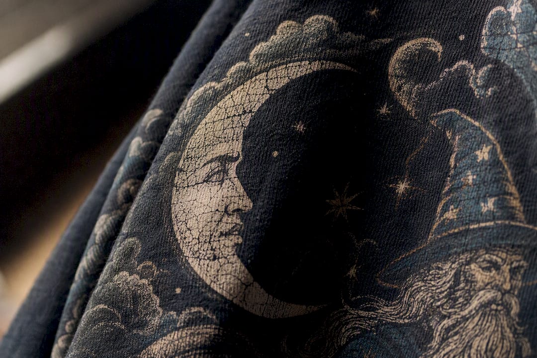
The best 2026 tees share one quality: they look made by a person, not generated by an algorithm. Hand-drawn linework, uneven ink coverage, and visible brush texture read as authentic precisely because they’re imperfect. A perfectly symmetrical vector logo feels dated next to a graphic with a little wobble in the line.
A few specific motifs are showing up again and again this year:
- Digital-surreal collage: scanned photos layered with glitch textures or pixelation
- Retro travel badges: vintage postcard fonts, sun icons, and faux-distressed borders
- Abstract geometry: overlapping shapes in muted color blocks, often asymmetrical
- Faded pastel washouts: soft, sun-bleached color fields behind bold central graphics
Print method matters here as much as the artwork itself. Intentional distress, cracked ink that’s baked into the design, reads differently from fake distress, a print that’s simply low quality and will crack further after two washes. Screen printing tends to hold up better over time than cheap heat-transfer vinyl, especially on graphics meant to look worn from day one.
Pro Tip: Zoom into product photos before buying. Genuine distressed printing shows uneven, organic cracking across the whole design; a poorly made print usually shows peeling only at the edges, which is a sign it won’t survive the wash.
Color and Palette Guide for 2026 Graphic Tees
Color choice can make or break how current a tee looks. Aquamarine has emerged as the standout color of the season for summer 2026, showing up as an accent in graphic prints, trim, and small design details rather than as an all-over shirt color. Neutrals, meanwhile, remain the foundation that makes everything else work.
- Pair an aquamarine-accented graphic with white, cream, or stone-colored bottoms to let the color pop
- Save saturated, bold colors for a single focal graphic rather than the whole shirt
- Reach for faded pastels when you want a softer, worn-in look that pairs easily with denim
- Use black or navy as your neutral anchor when the graphic itself is already colorful
Distressing changes how color reads, too. A faded pastel print looks intentional and lived-in, while a fresh, saturated print on the same washed fabric can look mismatched. Match your fading level across the whole shirt, not just the graphic.
How to Style Graphic Tees in 2026
There are two clear routes this year, and both work. The maximalist-playful route leans into the tee as the star: bold color, loud graphic, minimal competition from the rest of the outfit. The tailored-modern route does the opposite, using structured pieces to quiet the tee down so it reads as elevated rather than casual. GQ’s own styling coverage confirms both approaches are current, so the choice comes down to your mood, not a rulebook.
-
Tee plus blazer. Throw an oversized nostalgia tee under a structured blazer, leave it slightly untucked, and add straight-leg trousers. This is the fastest way to make a graphic tee look work-appropriate.
-
Tee over a turtleneck. Layer a fitted turtleneck under a slightly cropped or boxy tee for cooler days. The contrast in texture, smooth knit under a printed cotton graphic, adds visual depth without extra effort.
-
Tee with a beaded or textured skirt. Pairing a plain or minimally-graphic tee with something textured and dressier, a beaded midi skirt or a slip skirt, is one of the clearer signs of the tailored-modern shift. Stylists have moved away from the early-2000s mall-rat pairing of graphic tee plus basic jeans toward these more considered combinations.
-
Tee tucked into tailored trousers. A French tuck into wide-leg or straight trousers instantly reads more grown-up than a full tuck or letting the shirt hang loose.
On silhouette: oversized fits suit bold, single-graphic designs where you want the print to have room to breathe, while fitted or slightly cropped tees work better for busier or text-heavy graphics you don’t want lost in extra fabric. Footwear-wise, chunky loafers or clean white sneakers finish the tailored route, while retro runners or platform sandals suit the maximalist route.
Pro Tip: If you only own one statement tee, build the rest of your outfit in neutrals first, then let the shirt be the loudest thing in the room. Two loud pieces fighting for attention is the fastest way to make an outfit look unfinished.
For more layering formulas and seasonal outfit breakdowns, the styling guide on trendy casual looks walks through additional combinations worth trying.
Materials, Fit, and Quality: What to Check Before You Buy
A great graphic doesn’t matter much if the shirt falls apart in three washes. Fabric weight is the first thing to check: anything under 150 grams per square meter tends to feel thin and see-through, while 180 to 220 grams per square meter hits the sweet spot most people associate with a substantial, well-made tee.
- Check the shoulder seams in product photos; they should sit flat, not puckered or stretched
- Look for a reinforced neckline, ribbed collars hold their shape far longer than a simple hemmed edge
- Screen printing generally outlasts vinyl heat-transfer for graphics meant to survive regular washing
- Read the fabric composition; a cotton blend with a touch of polyester resists shrinking better than 100% cotton
- Favor brands that list wash instructions clearly, since it usually signals they’ve tested the print for durability
Sustainable options are also easier to find than they used to be, particularly tees made with organic cotton or recycled polyester blends, which tend to hold color and shape better over repeated washes than ultra-cheap fast-fashion cotton.
Where to Shop for Trend-Forward Graphic Tees
Finding a genuinely good tee online comes down to a short checklist, whether you’re browsing a big retailer or a small independent shop.
- Look for multiple product photos, including close-ups of the print texture and fabric weave
- Check that the listing states fabric weight, print method, and fit type, not just “soft and comfortable”
- Read a handful of honest customer reviews, especially ones that mention sizing or wash results
- Confirm the return policy before buying, especially for fit-sensitive oversized styles
- Watch for small-batch language like “limited run” or numbered releases, which often signals more careful production
Indie makers tend to win when you want a specific, unusual illustration style or a truly limited design. Larger retailers make more sense when you want consistent sizing, faster shipping, and a wider range of trend options in one place. The buying guide for trendy graphic apparel breaks down more of these signals if you want a deeper checklist before checkout.
What Josh and 3wizardclothing’s Customer Data Show
Josh has spent seasons tracking which graphic styles actually sell versus which ones just look good on a mood board, and that pattern shows up clearly in the brand’s own numbers.
That’s part of why 3wizardclothing’s curation leans into both humor and restraint at once, rather than betting the whole season on one aesthetic.
Why This Tee Revival Is Really About Restraint
The 2026 graphic-tee comeback isn’t really about nostalgia for its own sake. It’s a reaction against years of over-polished, algorithm-optimized fashion, where a slightly imperfect, hand-drawn shirt suddenly feels more honest than anything engineered to perform well on a feed. One well-chosen tee is a smarter style investment than five forgettable ones, because it does the work a whole outfit used to do. If you’re rebuilding your rotation, start small: pick two or three tees that actually say something about your taste, then build the rest of your closet around them.
— Josh
Shop the 2026 Graphic-Tee Trends With 3wizardclothing
3wizardclothing gives you a curated shortcut through everything covered above, so you’re not scrolling through hundreds of generic listings hoping to spot a good print.
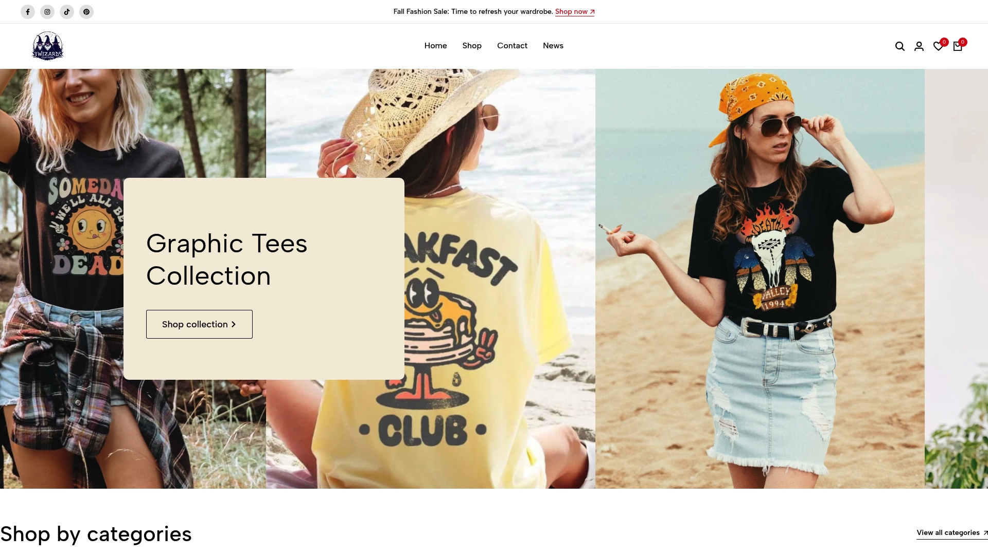
The new arrivals section groups tees by category, men’s, women’s, unisex, and kids’, so you can jump straight to the nostalgia, humor, or minimal-motif styles that fit your closet. Every listing includes sizing details and fit notes, which matters more this year than ever given how much oversized versus fitted silhouette affects how a graphic reads. If one of the trends above caught your eye, browse the new arrivals and see which tee earns a spot in your rotation this season.
Sources
- Graphic T-Shirts Are Back—In the Britney, Paris and Nicky Way | Who What Wear
- The Graphic Tees GQ Editors Are Buying This Summer 2026 | GQ
- 15 T-Shirt Design Trends for 2026 | Printful


