

A minimalist graphic tee is a well-made basic with one small, clean print, usually a single line drawing, a tiny logo, or a muted word mark, rather than a chest-covering photo or busy design. The fastest way to buy one is to skip generic search results and shop curated minimalist collections directly, including 3 Wizard Clothing’s simpler picks alongside its bolder graphic lines.
TL;DR:
- Buyers should prioritize mid-weight cotton or cotton-modal blends and check for detailed fabric composition to ensure long-lasting quality and appearance.
- It is important to examine close-up photos of the actual print and model fit images to verify the design’s minimalist qualities before purchasing.
- Small, centered prints in one or two muted colors using thin lines are key features that define true minimalist graphic tees.
- Avoid listings with large, distressed, or cluttered graphics, even if labeled as minimal, to prevent receiving a less refined product.
- Established curated brands like 3 Wizard Clothing provide standardized options with verified fabric and print quality, reducing the risk of buying subpar minimalist tees.
Table of Contents
- Where to buy minimalist graphic tees
- What design features define a minimalist graphic tee?
- Which fabrics and construction hold up best?
- How do you style a minimalist graphic tee?
- What fit and size actually look minimalist?
- How do you care for prints so they don’t crack or fade?
- How 3 Wizard Clothing curates minimalist tees
- The minimalist tee market has a quality problem nobody talks about
- Shop 3 Wizard Clothing’s Minimalist Picks
- Sources
Where to buy minimalist graphic tees
Three source types cover almost every shopper’s needs, and each one solves a different problem. A dedicated apparel retailer’s own site is best when you want a curated line built around one aesthetic, since the whole catalog has already been filtered for you. Big marketplaces are best for volume and price comparison, but that volume comes at a cost: marketplace listings for “minimalist” tees vary wildly in fabric weight and print quality, so the label alone tells you very little. Independent and artist-run shops sit in between, offering one-of-a-kind line art you won’t find anywhere else, often in smaller batches.
Search smarter, not longer. Terms like “minimal,” “line art,” “small print,” and “subtle graphic” filter out the loud stuff faster than “graphic tee” alone. Many retailers also group these under collection names like “essentials” or “everyday,” which is worth clicking into directly.
Before adding anything to a cart, check three things on the product page:
- Close-up photos of the actual print, not just a full-body shot from ten feet away
- The fabric composition and weight, listed near the size chart
- Model photos showing how the shirt drapes on a real body, not a mannequin
That close-up photo matters more than shoppers assume. Product pages with clear print close-ups and detailed fabric composition consistently reduce buyer uncertainty, which is exactly why the best minimalist tees on the market almost always show one.
Watch for the bait-and-switch version of “minimal”: a listing that uses the word in its title but ships a shirt with a large distressed graphic, a cluttered background pattern, or oversized text. If the thumbnail needs a second look to tell it’s simple, it probably isn’t.
What design features define a minimalist graphic tee?
Scale and placement do most of the work. A minimalist print sits small, usually centered on the chest, over the left pocket area, or as a tiny mark on the back shoulder. Anything that spans the full chest or wraps around the sleeve has already left minimalist territory, no matter how clean the artwork looks.
Color palette is the second tell. True minimal designs stick to one color, or at most two muted tones, against a solid, neutral shirt. Negative space isn’t wasted space here. It’s the point.
Style-wise, look for:
- Thin-line illustrations instead of thick, filled shapes
- Simple geometric marks like a single dot, dash, or outline
- Minimal or absent typography, and when text appears, one small word or a short phrase in a plain font
Print method matters more than most shoppers realize. A design that sits flat against the fabric, rather than sitting on top in a raised, textured layer, keeps the minimalist look intact wash after wash. Heavily textured or puff prints tend to crack and thicken over time, which works against the whole point of a clean design.
Pro Tip: Before buying, browse a design inspiration site like Dribbble’s minimalist t-shirt tag, which indexes hundreds of examples. Use it to figure out which scale and style you actually like, then go shop for a tee that matches that exact look instead of guessing from thumbnails.
Which fabrics and construction hold up best?
Fabric choice decides whether your minimalist tee looks sharp in month six or starts pilling and sagging. Ringspun cotton and cotton-modal blends are the two safest bets, since both hold a smooth surface that lets a thin-line print sit cleanly instead of sinking into rough, uneven fibers.
Weight matters too. A mid-weight knit, somewhere between a flimsy summer tee and a heavy fleece-style shirt, gives enough structure for the fabric to hang flat rather than cling or wrinkle around the print area.
On the product page, check for:
- Listed composition percentages (100% cotton, or a cotton-modal split)
- Any mention of stitch quality, like reinforced seams or double-stitched hems
- Model fit photos showing how the shirt sits at rest, not stretched or pinned
Expect some trade-offs. A lighter, breathable knit will wear thinner faster than a mid-weight one, and that’s a fair trade for softness. What’s not worth accepting is vague fabric descriptions with no percentage breakdown at all.
How do you style a minimalist graphic tee?
The tee does the least work in the outfit on purpose, which means the rest of your pieces need to stay just as restrained. Three formulas cover almost every situation:
- Casual everyday: Tee, slim or straight-leg jeans, clean white or neutral sneakers. This is the default combination for a reason. It puts the print at the center without competing textures or colors pulling focus.
- Smart-casual: Tee layered under an unstructured blazer or a lightweight overshirt, paired with chinos. The structured layer dresses up a basic tee instantly, and it still reads relaxed since the shirt underneath stays simple.
- Layered minimal: Tee under a thin knit sweater or a light jacket, worn open or with the collar visible at the neckline. This adds visual interest through texture and layering rather than through a louder graphic.
Two rules keep any of these from falling apart. First, balance print size against outfit simplicity. A tiny chest logo can handle a busier layering piece, but a bold single-color graphic needs everything else to stay quiet. Second, cap your palette at two or three colors total, including the shirt. For deeper outfit breakdowns and seasonal pairing ideas, 3 Wizard Clothing’s styling guide walks through additional combinations beyond these three.
What fit and size actually look minimalist?
Fit changes the whole read of a minimalist tee more than the print does. A slim fit skims the body and gives the cleanest, most tailored version of the look. Regular fit sits with a little room through the chest and shoulders without going boxy, which works for most builds. Relaxed fit adds noticeable extra room everywhere, better suited to layering or a deliberately looser aesthetic.
A few sizing habits cut down on returns:
- Size up one from your usual if you plan to layer the tee under a jacket or sweater
- Size down slightly only if you want a snug, tailored silhouette and the fabric has some stretch
- Compare the brand’s actual garment measurements (chest width, length) against a shirt you already own and like, rather than trusting the size label alone
- Check listed model height and the size they’re wearing in photos, since that context tells you more than a size chart in isolation
Always check the return policy before checkout, especially on a first order from a new brand.
How do you care for prints so they don’t crack or fade?
Prints fail long before fabric does, almost always from heat and rough handling. Wash the tee in cold water, turned inside out, on a gentle cycle, and skip bleach entirely, since it breaks down both dye and print pigment fast.
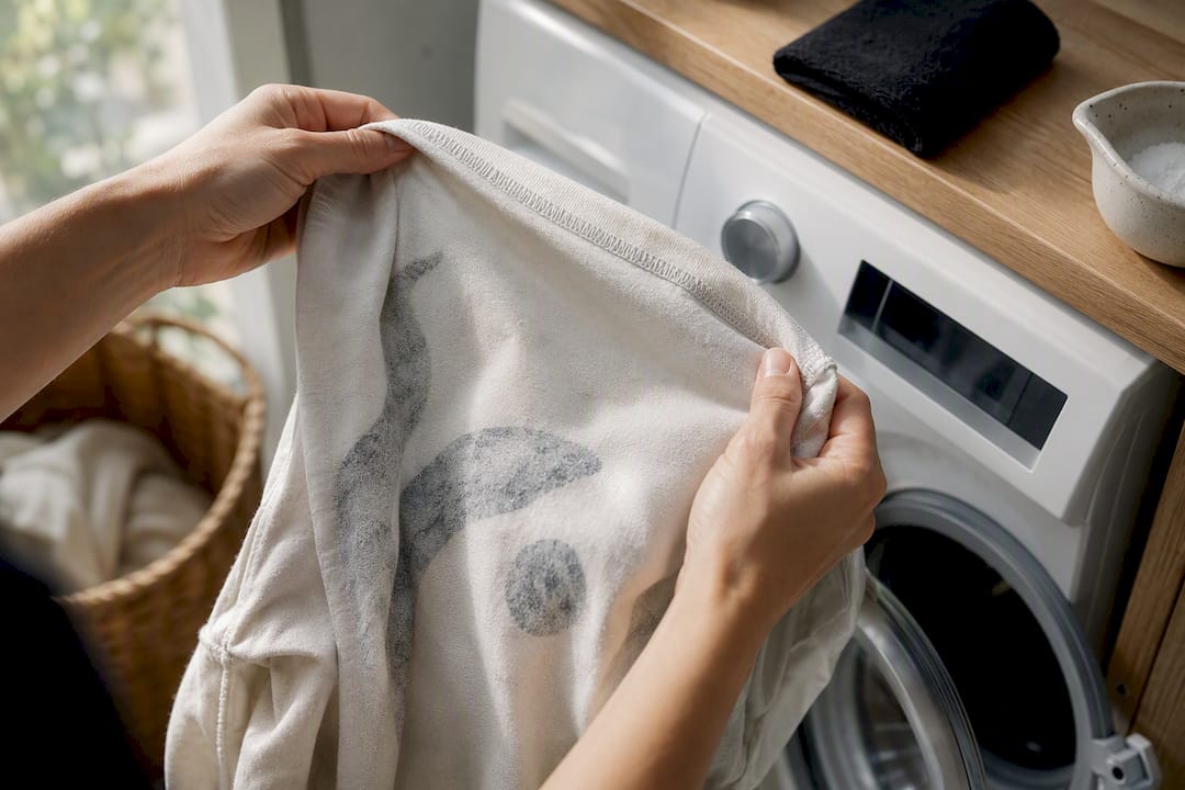
Drying does more damage than washing in most cases. Air-drying is safest; if you need a dryer, use low heat only; high heat is the single most common cause of shrinkage and cracked prints.
For storage, fold rather than hang if the print sits over the shoulder or upper chest, since a hanger can stretch that area out of shape over time. Keep folded shirts out of direct sunlight, which fades both fabric dye and printed ink unevenly.
For specific fabric blends, 3 Wizard Clothing’s care guide breaks down product-specific washing notes, and the step-by-step care walkthrough covers drying and storage in more detail.
How 3 Wizard Clothing curates minimalist tees
Most of what comes through our design pipeline leans loud on purpose. Internal data shows many shoppers on our site prefer playful, bold prints over subtle ones, which tells you something real: minimalist demand is a genuine minority preference, not a majority trend dressed up as one.
That’s exactly why we don’t treat our simpler designs as an afterthought. Pieces like the Be The Unique One barcode tee and the Keep It Simple Sneaker Tee exist specifically to give that other 55% a real option, built to the same fabric and construction standard as anything else on the site, just quieter on the front.
The minimalist tee market has a quality problem nobody talks about
Here’s what most buying guides skip entirely: “minimalist” has become a marketing word almost as diluted as “premium.” Type it into any marketplace search and you’ll get a flood of results, and a good chunk of them are just regular graphic tees with the busiest elements cropped out of the thumbnail photo. That’s not a design philosophy. That’s a listing trick.
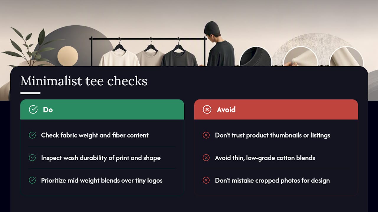
The real test isn’t whether a shirt looks calm in a product photo. It’s whether the print sits flat after six washes and whether the fabric held its shape. A single-color line drawing on a thin, low-grade cotton blend will look “minimalist” for exactly one wear before it starts pilling and the ink starts cracking at the edges. At that point you don’t have a minimalist tee. You have a worn-out shirt with a small, cracked logo on it.
My honest read is that fabric weight matters more to the finished look than the graphic itself, and almost every roundup gets that backward. A mid-weight cotton-modal blend with a slightly bolder print will still look cleaner in a year than a bargain-bin cotton tee with the tiniest possible logo. Buy for the fabric first. The print is the easy part to get right.
— Josh
Shop 3 Wizard Clothing’s Minimalist Picks
Skip the marketplace guesswork and shop a catalog where fabric weight, print placement, and fit details are already sorted by category, so you’re comparing real options instead of digging through mismatched listings.
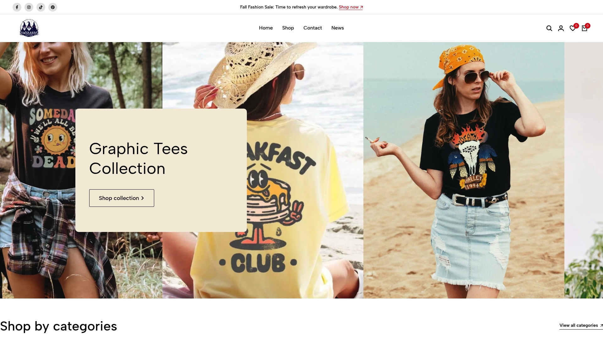
If you’ve read this far, you already know what to check: small-scale prints, clean palettes, mid-weight cotton blends, and a fit that matches how you plan to wear it. 3 Wizard Clothing’s full catalog carries both the bold prints most shoppers gravitate toward and quieter, cleaner designs for the days you want the shirt to say less. Browse the current collection and check the product pages for fabric composition and close-up print shots before you decide, then place your order once you find the fit and print that match what you came here looking for.


